By Team BuzzBizzAI
21 Jan, 2026
When Microsoft refreshed its look in 2023, nobody panicked, applauded wildly, or wrote manifestos about it. But that is changing. The logo was clean. The colours were calm. The typography was sensible. It felt less like a creative statement and more like corporate housekeeping done very well.
People nodded and moved on.
A year later, the internet has quietly pulled it back into the spotlight, not because of nostalgia, but because AI has stress-tested it.
Designers and meme makers have been feeding Microsoft’s identity into image generators, video models, and 3D tools, stretching it into space scenes, neon billboards, and retro grids. And instead of breaking, it holds up. The shapes are simple. The colours are flat. The system is modular. AI can remix it without turning it into visual mush.
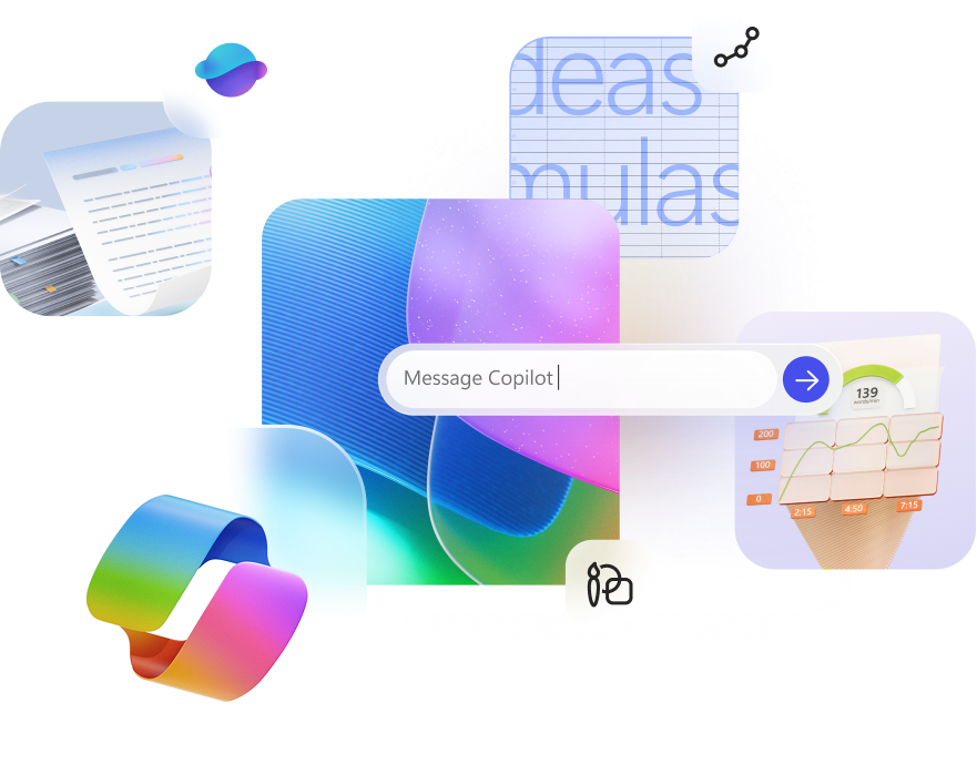
Image Source- Microsoft Copilot
That is the real story. Microsoft did not design a cool brand. It designed a readable one, and machines love readability.
Flashier identities from the same era tend to dissolve when AI touches them. Microsoft’s does not. It collaborates with the machine instead of fighting it.
The lesson for marketers is clear. In an AI world where logos get regenerated endlessly, durability matters more than drama. Brands are no longer judged only by how they look to humans, but by how well machines can understand them.
Sometimes boring is not boring. It is future-proof.
Other Articles

Best AI Marketing Certifications to Add to your Portfolio
Is Smartlead AI the Best For Email Marketing

No Comment! Be the first one.